
Responsive Images using and srcset/sizes
Jul 1, 2014
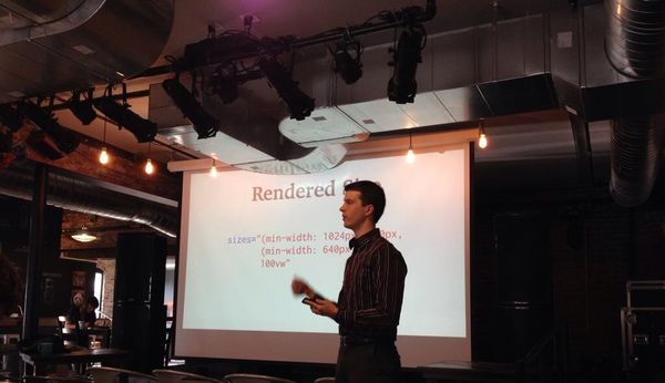
I spoke at Omaha Coffee & Code about the work the Responsive Images Community Group has been up to lately:
Big heavy images are responsible for most of the bloat on a responsive website, but it doesn't have to be that way. Here's the latest HTML elements you can use to keep your images small, and your site lean & fast.
Slides
Screencast
Thanks to Eric Portis's amazing post on srcset/sizes, which really helped me understand how these new elements worked, and from which I borrowed liberally.
Photo credit: Rebecca Stavick